This is the final edition of my film magazine cover.

Masthead
 For the masthead on my magazine I made sure the text was incredibly large so it would be easily visible to the audience. I also used a bright colour to reinforce the visibility of the masthead. The name ‘Action’ refers to what is yelled by a director on a film set, and this word will connote a film magazine to the audience. As this is a fairly new magazine to hit the newsstands I decided to place the masthead on top of the main image. The audience will then be able to clearly see what the magazine is called. Only when the magazine has built up a loyal readership will it be more acceptable to have the main image overlapping the masthead. The font used in my masthead was a staple for the rest of the font used on the magazine cover and created consistency which will appeal to the reader. The masthead is positioned in a conventional place as the readers will be drawn to this place on the magazine first.
Main Image
 Unconventionally I used a two shot for the cover of my magazine. Film magazines tend to be liberal in their choice of shot, and even use long shots on their covers to cover a range of mise-en-scene features, however it is still quite rare to see a two shot on the cover of a film magazine. The main image itself was heavily manipulated using computer software so I could achieve the desired effect, a ghoulish girl. I manipulated one image more than the other to create a juxtaposition between the two images. Even though the pictures were of the same person, I wanted to create two different characters. The image location, which can be seen in the background, features on both the film poster and trailer to create cohesion between my media products. Using the location in the background should also appeal to horror film fans as well as regular buyers of the magazine.
Layout
 This layout of my film magazine is conventional. It has a skyline and masthead at the top of the page, a main image occupying the entire space as well as anchorage text, cover lines, a starburst, a barcode, issue and price. Without even one of those features the cover would not qualify as a magazine cover. I have structured my magazine in straight lines. This makes the cover appear tidy and more professional, even though the font used is slightly uneven. However I feel the uneven font can be justified by the price of the magazine. I wanted the layout to imply action and for the cover to live up to it’s title. Otherwise it would be weird having a magazine called action, with an incredibly boring layout!
Skyline/Slogan
 I placed a skyline at the top of my magazine cover to allow more content to be displayed without taking up the space that more cover lines would. I stuck with the consistent orange for the background and used the same font. Because it’s a skyline you dont have the same amount of room for the detail a cover line would convey, therefore I placed the name of four actors which feature inside the magazine. This will attract fans of these certain actors to want to buy this magazine. Once I had a loyal readership for this magazine, I would then think about replacing the skyline with a slogan, but it didn’t feel right placing a slogan on the magazine just yet as most slogans claim their magazine to be superior, and I don’t think that could be possible for ‘Action’ magazine just yet due to the amount of issues already published.
Anchorage Text
 Placing anchorage text on a magazine front cover is another convention I have used on my own magazine front cover. In this instance the anchorage text refers to my own horror film. To make this text stand out even more, instead of just using a larger font I used the title font for the film title too. I then used the standard magazine font for the rest of the anchorage text so I didn’t lose too much consistency on the cover. The alteration in font will make the anchorage text stand out to the reader because they will be automatically drawn to the differentiation in font. I have also coloured the anchorage text white, as opposed to all the other main text which is in orange. This again catches the attention of the reader and makes this text stand out more because it is a distinctly different colour.
Cover Lines
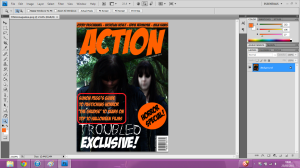 As well as the anchorage text I have placed three other cover lines on the magazine. There isn’t a particular number of cover lines to be placed on the cover conventionally, however it is important to get the right amount as too many can make the magazine appear messy and full, but too little can make the magazine seen bare and empty. Both of these are then unappealing to the reader, and they will be less likely to buy the magazine. The cover lines are in an orange text as this distinguishes them from the anchorage text because these are other things included in the magazine but is not the focus of the main image. I decided to keep the generic font for this magazine to create consistency on the cover and make the text flow better because too many different fonts wouldn’t look very nice. I also kept the size of this text relatively smaller than the anchorage text so that the text could be easily distinguished as cover lines and not the main story. The cover lines were placed in this position as it didn’t obstruct the main image too much and the best parts of the main image were still visible, but the cover lines are also still easy to see and read. They are also placed on a dark part of the main image which contrasts with the orange text, making it a lot easier to see from a distance.
Starburst
 Starbursts are becoming an increasingly common convention on magazine covers and it involves placing an exciting piece inside of a coloured shape to make it stand out. I have decided to use a starbursts to alert readers that this issue of the magazine is a horror special. I have stuck to the orange colour on this cover and used a black text and the same font as the cover lines, against to create consistency. This starburst will appeal to my audience because it is informing them of the horror special. Horror fans will be interested in this issue as well as regular readers. The starburst is an adequate size, if it was smaller it would be a waste of time as it wouldn’t be very visible or eye-catching but if it was any bigger, it would be too big and cover up parts of the image and make the cover appeal messy. I also placed the text on an angle slightly so that is would contrast with the other text on the cover, which is all in straight lines, this makes the starburst text stand out even more.
Direct Address
 I used a conventional form of direct address on my magazine cover with one of the characters in the two shot staring at the camera, as if they are looking at the reader. A lot of magazines do this as it makes the reader feel as if they image is staring directly at them, almost willing them to buy the magazine. This type of direct address also appeals to the reader more than the use of personal pronouns for example as it is less effort for them to look as something as opposed to reading it. I decided using against personal pronouns on my magazine cover as I had already used them on my film poster and after creating my cover lines it didn’t seem appropriate to add in personal pronouns.
Colour Scheme
The colour scheme used on this cover was to coincide with the October issue which is the month when Halloween is. Orange is just one of the colours which has a Halloween connotation, but after thinking about a few colours which also connote Halloween, I chose orange as this worked the best along with the other colours on the main image, such as the green trees, green being another Halloween connoted colour. The orange was also bright and eye-catching, which was popular on the audience feedback I received As previously stated I used white text to display the anchorage text. This became part of my colour scheme because I couldn’t use black, the other colour used for text, on top of an already dark place on the main image. I also used the orange for the skyline at the top of the cover to create consistency. If I had used any more colours to what I have already then the magazine would become untidy in appearance and inconsistent and this is most likely to put potential customers off picking up the magazine to look at it more.
Barcode
 A barcode is a must-have convention on a magazine cover, unless it’s a free publication, because without it a checkout till will not be able to recognise the product to allow the customer to buy it. I placed it in a corner of the magazine, which is also conventional, as this keeps the barcode out of the way of important text and the main image. The right hand corner was the best place to position the barcode because the anchorage text and cover lines were both on the left hand side, so the barcode could sit right under the starburst.
Price
 I chose to price my magazine at £1.50 to correspond with the overall look of the cover. While the issues are published monthly, the layout does not have the same class as most monthly glossy magazines, and the bright colours and cartoon-esque font only cement this further, therefore I feel £1.50 is a suitable price for the magazine. This price also means that there won’t be any more than 100 pages within the magazine, with a fair amount of them being advertisements.
 Once I had trimmed down certain shots I then added in some more of the footage I took whilst shooting on location, as well as a shot of the cinema release date and websites related to the film, this gives the audience extra activities to take part in and gather interest in the film at the same time.
 Once I had added in the extra footage, I sharpened up the fading on the trailer, as suggested by another person on the audience feedback. I made sure that every piece of video footage faded in and then faded out again, apart from the set of quick cuts towards the end of the trailer.
 Lastly I made sure that all of the audio was in the correct place, as this was something my audience feedback seemed to like a lot.
 After I had completed these improvements I was happy with how my trailer looked and elected this as my final piece.


