Evaluation: How did you use media technologies in the construction and research, planning and evaluation stages?
As well as the technologies mentioned in the slide show, I also used http://www.freesound.org/ to acquire the sounds used in my teaser trailer. The website allowed me to download sounds legally to use in my teaser trailer. Overall this has enhanced the final result a great deal because without it I would not have been able to have used any sound in the teaser trailer, which would make the trailer extremely dull and it would not fit into the horror genre, because sounds are one of the main conventions.
At the beginning of the project I also used http://prezi.com/, which allowed me to create an interactive mind map. On this mind map I listed horror forms and conventions as well as ideas for my own media products. This improved the overall result because it makes my blog more interactive and exciting to use.
Evaluation: What have you learnt from your audience feedback?
What have your learnt from your audience feedback?
Collecting audience feedback has been very helpful for me during this process as it has given me some really good ideas. Gathering audience feedback is refreshing because while I have been familiar with the media products for sometimes weeks before uploading them for feedback, this is the first time the audience has seen them, so any doubts that have grown for me whilst working on the products will either be confirmed or dismissed.
I gathered feedback in a number of ways. Firstly I created a questionnaire and handed it out to 15 of my friends randomly. It was appropriate to hand the questionnaire out to my friends as they are similar to the demographic who watch horror films, meaning their opinion could represent a number of people in their age bracket who like watching films. I asked standard questions like their age and gender as well as film related questions like where they find out about new films and where they prefer watching films. The questionnaire results were analysed early on in the project meaning that the results on my three media products were influenced to a certain degree by my questionnaire results.
Primarily my feedback came from my friends on social networking websites such as Twitter and Facebook. This was a good way of collecting feedback in terms of aesthetic aspects as opposed to technical issues that may need sorting. The majority of my friends on these social networking website do not study Media Studies. They were able to offer me tips and give me constructive criticism on the appearance of the media products, which is incredibly helpful as the media products aren’t intended for people who know all the technicalities of a film poster, film magazine cover and film teaser trailer.
Another way of gathering feedback was from my teacher. She left comments on individual posts my blog which allowed me to improve aspects of the posts which needed it. As well as constructive criticism she also told me in her comments which parts of the post she liked, which gave me confidence in the posts after, as I could use the good elements in all of my posts. My teacher also gave me a list of improvements to do towards the end of my coursework project so that I could get the blog to the best of my ability. This feedback was invaluable because as my teacher she knows exactly what needs to be included in the blog.
A final way of gathering feedback was with my classmates. Towards the end of our coursework we reviewed each others work as a whole (the content on the blog as well as the three media products) and I found this was very helpful because we are both in the same situation. Both of use were at the same stage in our coursework when we reviewed each others work which allowed us to both give a balanced review. I was able to used her review and improve my work where it needed to be and the be able to feel more comfortable with the other aspects of my media products which didn’t need any improvement.
From all of this feedback I have learnt how to take feedback from people and then interpret it by making changes to my media products. Some things I were unsure of, especially in my trailer, were confirmed by my audience feedback, making in an invaluable tool in the process of making my media products the best they can be.
Evaluation: How effective is the combination of your main products and ancillary texts?
Evaluation: In what ways do your media products use, develop or challenge forms and conventions of real media products?
In what ways do your media products use, develop or challenge forms and conventions of real media products?
Forms and conventions are the things that make a media product recognisable. Horror forms and conventions, as previously researched, include macro elements such as enigmatic narratives and hegemonic representation of gender as well as micro elements such as low key lighting, eerie non-diegetic sounds and jump cuts. There are also forms and conventions for individual media products themselves which need to be followed.
Film trailer conventions include:
- Cast and production company details
- Film title
- Release date
- Short in length
- Sounds appropriate to the genre portrayed
- Slow pace amounting to a fast paced montage
Film poster conventions include:
- Film title
- Credits
- Main image
- A hook/tagline
- Release date
And film magazine cover conventions include:
- Masthead
- Anchorage text
- Cover lines
- Star burst
- Barcode
- Issue date
- Price
- Sky line
- Main image
In the slide show below I have evaluated how I have either used, developed or challenged horror forms and conventions in my own three media products.
Research: Reviewing Other People’s Work
My Review of Abbi’s A2 Media Coursework
Abbi,
The content of your A2 Media blog clearly demonstrates that you have a high level of understanding of the horror genre and what it takes to create a successful horror teaser trailer along with the two ancillary products. You have thought very carefully about the forms and conventions that need to be included in your media products and applied them really well.
It is clear that your detailed analysis of trailers, posters and magazine covers have been useful in the production of your own media products and stating your influences has also demonstrated your understanding of the genre further.
Your extensive research into narrative theories as well as the horror genre itself shows that you are committed to the project and that has resulted in you achieving three brilliant media products. It seems you have also developed many skills during the creating process on software such as Adobe Premiere Pro CS6, which will be useful for you in the future, again showing your commitment to the project.
You have applied knowledge we acquired last year during our AS year to do with camera shots/ angles and editing, and have used these micro elements very successfully.
Overall your three media products are consistent and work very well together. I really enjoyed watching your trailer and it evoked all of the emotions and feelings you would expect from a horror film trailer. I really like all three of the media products.
Shannon Cotton
Abbi’s Review of My A2 Media Coursework
Shannon,
From your A2 Media blog I can clearly see the product you intended to produce throughout your whole project. To start with their is a great amount of research you have done, you have clearly looked at existing magazine front covers, film posters and trailers- this clarifies that you are trying to get as much knowledge as possible before you go onto producing your own.
The presentation of your blog is easy to read. It is easy to follow and I don’t have to keep going back, I can see the steps that you have taken to get to your final pieces. You have clearly demonstrated on each post what you are aiming towards and why you have analysed/criticised/chosen to talk about it.
You have shown a clear understanding of the skills and technology you have used, especially in Photoshop, Adobe Premiere pro and the internet itself. You have applied your knowledge well, and referred back to the terminology from the theory side, you have also related back to the theory side by showing your understanding of narratives, feminist theory and postmodern theories, this shows that not only have you produced two fantastic pieces, you have analysed the theory behind it which has lead you to produce these pieces.
I can see the clear development of your final pieces and the depth of thought you have gone through to successfully complete them, such as doing questionnaires and getting feedback, also thinking about colour scheme and typography. You have shown the forms and conventions of magazine front covers, film posters and trailers that you have considered to bring the pieces together. I also like the development, the print screens gives me a clear understanding of the process you went through and the changes you made depending on your feedback.
As much as I enjoyed looking and watching your final pieces, the only constructive criticism I have is dialogue in the trailer. Dialogue is a convention in a trailer from what I have researched and I think this would work well, especially with the captions, there could be a few voice overs. I think that as you can’t actually see the characters faces, you could get a feel of what they are like through their voice. On the other hand, this may not work at all and it only works in a few trailers. Having no dialogue could be something you have specifically not put in.
In conclusion, I really enjoyed analysing your blog as it is beneficial to both of us. All your final pieces are superb and I think they all link together perfectly. The images clearly link with the trailer and so on. I definitely got a fright from your productions and I think they are all great.
Abbi Chard.
Evaluation: Schedule Of Work
Creating: Film Trailer Final Piece
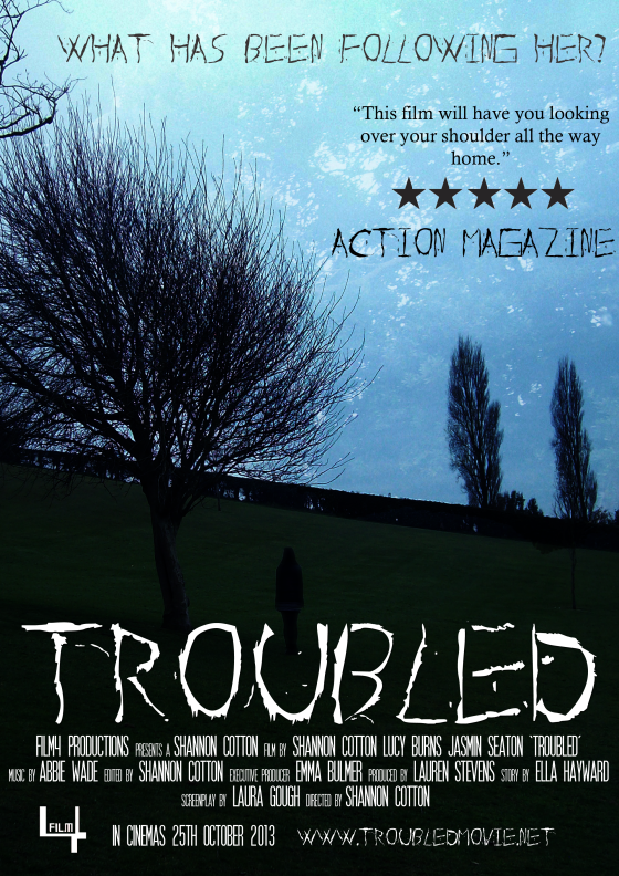
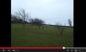
This is the final film trailer for my fictitious horror film Troubled.
Below is a breakdown of micro media elements within the trailer and my reasons for including them in the trailer.
Camera
I used a variety of camera shots and angles in my film trailer to try and replicate horror trailer conventions and create an eerie atmosphere. These shots were used in conjunction with sound primarily to try and achieve the desired effect.
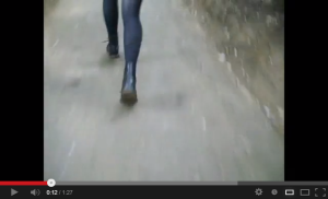
The first shot I used was a medium shot which was set at a low angle. This shot showed the character running away from something and the low angle represents the vulnerability of the main character. The medium shot added some ambiguity to the scene as the audience could not see the whole figure of who was running, therefore being unable to determine who it is or what they are running away from.
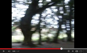
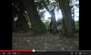
The second shot I used was a long shot with a high angle. The long shot was used to convey the surroundings of the location, which as a woodland area, is a typical convention for a horror film. I also used this shot especially for this scene because as you see the character walk between the trees it makes the audience feel as if they are being slightly voyeuristic. The high angle of the shot also conveys this point as the view the audience is seeing is the same as if they were lurking in the shadows at the actual location.
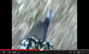
Another shot I used was a point of view shot. This shot was good to disorientate the audience and show the distress of the main character as she runs away from a mystery villain. The low angle that has been used with the shot also reinforces the vulnerability of the character to the audience. This is the second shot the audience has seen where the character is running away from something, this is going to build tension for my audience as they still aren’t aware of what is chasing the main character.
Towards the end of my trailer there is a quick sequence of shots edited at a fast pace. In this sequence of shots is an establishing shot. I have used this shot to help the audience gain a better idea of the surroundings in the trailer but still leave enough ambiguity to make the audience interested in watching the film.
I also used a fast panning shot to disorientate the audience even more. This combined with the fast editing made it difficult for the audience to determine the location of the shot and at the same time increases the tension. Fast panning is conventionally used in horror film trailers to speed up the pace and build tension amongst the audience.
Lastly an extreme long shot was used to build tension even further. This shot was added in towards the end of the past paced sequence which created even more ambiguity and hopefully makes the audience interested in what the dark figure is and why they are there. This shot is perhaps the most unconventional for a horror film trailer, but I found that it fitted in well with my trailer contextually.
Editing
The editing in my horror trailer started off slowly and then increased in pace like a conventional horror film. I followed this convention because without it you would not get the same feel to the trailer, and there would be no sense of horror, which is essential for a horror film trailer. I used jump cuts throughout the trailer to disorientate the audience and built tension. The audience would then never know which shot or footage would appear next and as well as creating tension this creates interest in the trailer.
The use of credits is also significant in my horror film trailer. A lot of trailers with well know people working on them will often be credited on the trailer because this can influence fans of theirs to watch the film. I tried to emulate this on my own trailer by including my name and the actress’ name, because, as seen on the actor’s profile, people may recognise the actress’ name or face and that could influence them to watch the film at the cinema.
Towards the end of my trailer I included a montage of panning shots of different locations within the overall woodland setting I was filming in to disorientate the audience.
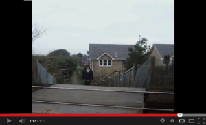
The last shot in the trailer appears to be a freeze frame for a few seconds until the train passes. I added this freeze frame edit to create a sense of anticipation amongst the audience. All they can see is the girl standing, staring at them, but why?
Sound
Eeerie sounds were essential for the trailer and I spent a lot of time searching out the best ones. I think that the sound is the most important component in a horror trailer as you can put different sounds over and piece of horror footage to create a completely different genre and effect. I also tried to get the sounds to correlate with what was happening on screen at the time, such as gong sounds for when writing appears, which could also be considered a sound motif for the text on the screen and sinister noise patterns when footage was being displayed. All of the sound has been non-diegetic and, unconventionally, I decided against adding in any dialogue or diegetic sounds to the trailer to grab the audience’s attention more. At the end I also created an intentional and conventional silence after the train has passed on camera. Sometimes silence can be just as effective as a loud crashing noise, in terms of getting the audience’s attention.
Mise-en-Scene
The location of the trailer was my most planned piece of mise-en-scene as the woodland area is isolated and a conventional setting for a horror film.
I decided to dress my main character in mainly dark clothes so that the boundary of whether the character is a villain or a hero was blurred to the audience. This is another tactic to gain interest in the film, as the character’s clothing will not hint if the character is being chased, or chasing someone, so the audience will naturally want to find out more. In terms of proxemics, the main character is always shown of her own to highlight the isolated state of mind the actress is trying to portray. The film itself is a story of a girl who is haunted by herself, so it is significant and relevant to show the actress on her own. To get my desired lighting effect I chose to film on a particularly overcast day. I didn’t want the weather to be sunny as this would be unconventional for a horror trailer, as a bright light does not convey fear or horror. The overcast skies connoted to the audience that all is not well and something bad could happen.
Creating: Film Trailer Improvements
After going over my storyboards again and accessing feedback from my audience I made the following improvements to my film trailer.
Firstly I shortened the shots in the trailer which I felt were too long. This was to make room for a variety of other shots, which was suggested by my audience feedback. This was the only major criticism my audience feedback had for me, so I had to make sure I took notice. 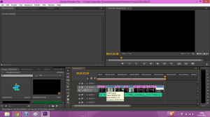 Once I had trimmed down certain shots I then added in some more of the footage I took whilst shooting on location, as well as a shot of the cinema release date and websites related to the film, this gives the audience extra activities to take part in and gather interest in the film at the same time.
 Once I had added in the extra footage, I sharpened up the fading on the trailer, as suggested by another person on the audience feedback. I made sure that every piece of video footage faded in and then faded out again, apart from the set of quick cuts towards the end of the trailer.
 Lastly I made sure that all of the audio was in the correct place, as this was something my audience feedback seemed to like a lot.
 After I had completed these improvements I was happy with how my trailer looked and elected this as my final piece.
Creating: Film Magazine Cover Final Piece
This is the final edition of my film magazine cover.
Masthead
 For the masthead on my magazine I made sure the text was incredibly large so it would be easily visible to the audience. I also used a bright colour to reinforce the visibility of the masthead. The name ‘Action’ refers to what is yelled by a director on a film set, and this word will connote a film magazine to the audience. As this is a fairly new magazine to hit the newsstands I decided to place the masthead on top of the main image. The audience will then be able to clearly see what the magazine is called. Only when the magazine has built up a loyal readership will it be more acceptable to have the main image overlapping the masthead. The font used in my masthead was a staple for the rest of the font used on the magazine cover and created consistency which will appeal to the reader. The masthead is positioned in a conventional place as the readers will be drawn to this place on the magazine first.
Main Image
 Unconventionally I used a two shot for the cover of my magazine. Film magazines tend to be liberal in their choice of shot, and even use long shots on their covers to cover a range of mise-en-scene features, however it is still quite rare to see a two shot on the cover of a film magazine. The main image itself was heavily manipulated using computer software so I could achieve the desired effect, a ghoulish girl. I manipulated one image more than the other to create a juxtaposition between the two images. Even though the pictures were of the same person, I wanted to create two different characters. The image location, which can be seen in the background, features on both the film poster and trailer to create cohesion between my media products. Using the location in the background should also appeal to horror film fans as well as regular buyers of the magazine.
Layout
 This layout of my film magazine is conventional. It has a skyline and masthead at the top of the page, a main image occupying the entire space as well as anchorage text, cover lines, a starburst, a barcode, issue and price. Without even one of those features the cover would not qualify as a magazine cover. I have structured my magazine in straight lines. This makes the cover appear tidy and more professional, even though the font used is slightly uneven. However I feel the uneven font can be justified by the price of the magazine. I wanted the layout to imply action and for the cover to live up to it’s title. Otherwise it would be weird having a magazine called action, with an incredibly boring layout!
Skyline/Slogan
 I placed a skyline at the top of my magazine cover to allow more content to be displayed without taking up the space that more cover lines would. I stuck with the consistent orange for the background and used the same font. Because it’s a skyline you dont have the same amount of room for the detail a cover line would convey, therefore I placed the name of four actors which feature inside the magazine. This will attract fans of these certain actors to want to buy this magazine. Once I had a loyal readership for this magazine, I would then think about replacing the skyline with a slogan, but it didn’t feel right placing a slogan on the magazine just yet as most slogans claim their magazine to be superior, and I don’t think that could be possible for ‘Action’ magazine just yet due to the amount of issues already published.
Anchorage Text
 Placing anchorage text on a magazine front cover is another convention I have used on my own magazine front cover. In this instance the anchorage text refers to my own horror film. To make this text stand out even more, instead of just using a larger font I used the title font for the film title too. I then used the standard magazine font for the rest of the anchorage text so I didn’t lose too much consistency on the cover. The alteration in font will make the anchorage text stand out to the reader because they will be automatically drawn to the differentiation in font. I have also coloured the anchorage text white, as opposed to all the other main text which is in orange. This again catches the attention of the reader and makes this text stand out more because it is a distinctly different colour.
Cover Lines
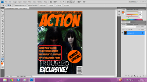 As well as the anchorage text I have placed three other cover lines on the magazine. There isn’t a particular number of cover lines to be placed on the cover conventionally, however it is important to get the right amount as too many can make the magazine appear messy and full, but too little can make the magazine seen bare and empty. Both of these are then unappealing to the reader, and they will be less likely to buy the magazine. The cover lines are in an orange text as this distinguishes them from the anchorage text because these are other things included in the magazine but is not the focus of the main image. I decided to keep the generic font for this magazine to create consistency on the cover and make the text flow better because too many different fonts wouldn’t look very nice. I also kept the size of this text relatively smaller than the anchorage text so that the text could be easily distinguished as cover lines and not the main story. The cover lines were placed in this position as it didn’t obstruct the main image too much and the best parts of the main image were still visible, but the cover lines are also still easy to see and read. They are also placed on a dark part of the main image which contrasts with the orange text, making it a lot easier to see from a distance.
Starburst
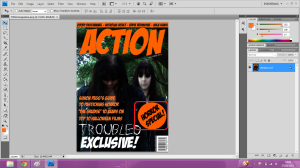 Starbursts are becoming an increasingly common convention on magazine covers and it involves placing an exciting piece inside of a coloured shape to make it stand out. I have decided to use a starbursts to alert readers that this issue of the magazine is a horror special. I have stuck to the orange colour on this cover and used a black text and the same font as the cover lines, against to create consistency. This starburst will appeal to my audience because it is informing them of the horror special. Horror fans will be interested in this issue as well as regular readers. The starburst is an adequate size, if it was smaller it would be a waste of time as it wouldn’t be very visible or eye-catching but if it was any bigger, it would be too big and cover up parts of the image and make the cover appeal messy. I also placed the text on an angle slightly so that is would contrast with the other text on the cover, which is all in straight lines, this makes the starburst text stand out even more.
Direct Address
 I used a conventional form of direct address on my magazine cover with one of the characters in the two shot staring at the camera, as if they are looking at the reader. A lot of magazines do this as it makes the reader feel as if they image is staring directly at them, almost willing them to buy the magazine. This type of direct address also appeals to the reader more than the use of personal pronouns for example as it is less effort for them to look as something as opposed to reading it. I decided using against personal pronouns on my magazine cover as I had already used them on my film poster and after creating my cover lines it didn’t seem appropriate to add in personal pronouns.
Colour Scheme
 The colour scheme used on this cover was to coincide with the October issue which is the month when Halloween is. Orange is just one of the colours which has a Halloween connotation, but after thinking about a few colours which also connote Halloween, I chose orange as this worked the best along with the other colours on the main image, such as the green trees, green being another Halloween connoted colour. The orange was also bright and eye-catching, which was popular on the audience feedback I received As previously stated I used white text to display the anchorage text. This became part of my colour scheme because I couldn’t use black, the other colour used for text, on top of an already dark place on the main image. I also used the orange for the skyline at the top of the cover to create consistency. If I had used any more colours to what I have already then the magazine would become untidy in appearance and inconsistent and this is most likely to put potential customers off picking up the magazine to look at it more.
Barcode
 A barcode is a must-have convention on a magazine cover, unless it’s a free publication, because without it a checkout till will not be able to recognise the product to allow the customer to buy it. I placed it in a corner of the magazine, which is also conventional, as this keeps the barcode out of the way of important text and the main image. The right hand corner was the best place to position the barcode because the anchorage text and cover lines were both on the left hand side, so the barcode could sit right under the starburst.
Price
 I chose to price my magazine at £1.50 to correspond with the overall look of the cover. While the issues are published monthly, the layout does not have the same class as most monthly glossy magazines, and the bright colours and cartoon-esque font only cement this further, therefore I feel £1.50 is a suitable price for the magazine. This price also means that there won’t be any more than 100 pages within the magazine, with a fair amount of them being advertisements.
